K4su

|
Joined:
May 2019
Posts:
32
Threads:
9
|
|
12-30-2021, 01:10 PM
(This post was last modified: 12-30-2021, 01:12 PM by K4su.)
Suggestion
Increase contrast on the current in-game UI.
Description
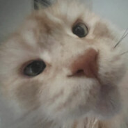
At some places the in-game UI has too little contrast for the text to be readable. Here's an example when playing as Hobo:

You can read up on which ratios should be used here: https://material.io/design/usability/acc...d-contrast
|
RadioactvePixels
|
Joined:
Jan 2019
Posts:
172
Threads:
5
|
|
I'll look into this. Thanks for bringing it to my attention!
Hello, I am a <player?> on No Cancer RP! If you have any questions or concerns, please add me on Discord: RadioactvePixels#0426
|
K4su
|
Joined:
May 2019
Posts:
32
Threads:
9
|
|
12-31-2021, 04:33 AM
(This post was last modified: 12-31-2021, 04:33 AM by K4su.)
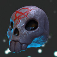
Just to show another example of where the contrast is too low. There might be other examples left though.

|
K4su
|
Joined:
May 2019
Posts:
32
Threads:
9
|
|
(12-30-2021, 07:26 PM)Radioactve Wrote: I'll look into this. Thanks for bringing it to my attention!
What's the status on this? 
|
K4su
|
Joined:
May 2019
Posts:
32
Threads:
9
|
|
Can I assume this suggestion to be rejected as there has been no activity from staff in over 3 months, even though the first reaction appeared positive?
|
Mr.Clutch
|
Joined:
Feb 2018
Posts:
64
Threads:
9
|
|
(04-06-2022, 03:57 PM)K4su Wrote: Can I assume this suggestion to be rejected as there has been no activity from staff in over 3 months, even though the first reaction appeared positive? Hey man I love that you are reaching out with suggestions for the server and I'm sorry that you feel like you are being ignored, I will mention this to the owner to make sure he is aware.
It's just me Mr.Clutch The Jr. Admin
If you have any questions/concerns about a rep I gave or anything you need help with, you can DM me on discord @Mr. Clutch#8675
|